Design is not colors and patterns. Or creativity. Yes, all of these elements do play a big role in any design. Instead, design is more about concepts and their execution than the frills that make it look pretty. Product design helps users solve a very specific problem in as simple a way as possible.
Once the preserve of highly trained design professionals, the internet has contributed its bit by democratizing design in a huge way. While free DIY website design tools like IM Creator let the average Joe on the street build beautiful responsive websites, A/B testing tools like Unbounce help make the website’s design user friendly and profitable.
But what happens when your fundamental product design itself is flawed? The product attracts very few users to begin with. The users that did try the product eventually get frustrated and give up on it. No amount of A/B testing can help a product that was all wrong to begin with. Such web design mistakes are often observed in popular business websites.
Here are a few make or break factors to keep in mind while designing your next product, website or service.
Design That’s Too Early For The Market
The risk of innovating and creating a brand new market is a huge one. One that many companies take and fail miserably at. The Apple Newton MessagePad Personal Digital Assistant was one such example.
Launched in 1993, the Apple Newton PDA was a forerunner of the smartphones that have almost becomes extensions of ourselves today. At a time when the internet itself was just a fledgling, geeky affair; a personal digital assistant aimed at helping you navigate everyday computing with ease was ambitious to say the least.
Besides the market not being ready for a PDA at that point in time, there were a few more factors that worked against the Newton. Firstly, it was priced at $700. That’s more than a no-contract, 16 GB iPhone 6 costs in 2015 dollars. It was heavy, large and too bulky to carry around. As Wired magazine puts it, “Handwriting recognition was supposed to be Newton’s killer feature, and yet it was the feature that probably ultimately killed the product.” The idea of taking notes on a ridiculously expensive toy instead of a good old notebook seemed stupid to most people. The comic strip Doonesbury ran a weeklong series lampooning the shortcomings of the Apple Newton leading to its eventual pull-out.
Design Over Usability
There is such a thing as too beautiful a design. When the frills and thrills of a product’s design begin to interfere with the actual usage of the product, that’s when problems creep in. You might be familiar with this problem from a truckload of beautiful websites that are a nightmare to navigate.
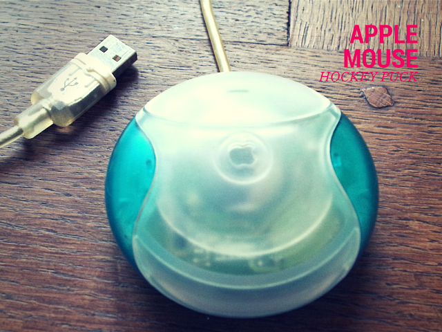
Apple’s Hockey Puck Mouse is a classic example of the triumph of gorgeous design over basic usability. Apple’s designers departed from the conventional oblong shape for their new mouse and decided on a more attractive perfectly round one instead. Enter the Hockey Puck mouse in 1998. The new mouse was colorful with a translucent body that set it apart from other mice. While the new mouse was decidedly better looking than its non-Apple counterparts, it was also a terrible product from an ease of use perspective.

The perfectly circular shape was not ergonomic and was impossible to hold and guide accurately. The Mac being the preferred computer of choice for designers made things even more difficult. The precise tracking and movement needed to design things on a computer meant that a circular mouse that was much smaller than average was doomed to failure. While the new mouse was the first mouse ever to offer USB connectivity, the USB cord was too short to be comfortable for easy movement, especially for right-handed users. Unsurprisingly it was retracted from shop shelves in barely two years.
Design That Make Easy Tasks More Complex
Often, in an attempt to fix something else, designers end up complicating the most basic functionality of a product.
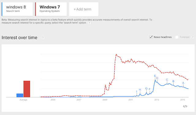
Windows 8 was an effort from Microsoft to integrate the operating systems across all its various devices – the PC, Windows phones and Windows tablets like the Surface. Windows 8 and its Metro UI was meant to elevate dowdy old Microsoft into the ‘designer approved’ echelons that Apple inhabited.
Unfortunately for Microsoft, Windows 8 fared even worse than Vista – that total disaster of an OS.
To begin with, Windows 8 forced long time Windows users to unlearn everything they ever knew about Windows and start from scratch. The old faithful Start button that housed every program on the PC was dumped altogether. Instead Windows 8 had a large and clunky Start Screen that needed ever more scrolling just to launch a program as the number of programs on the computer increased.

Shutting down the machine requires at least 3 clicks and instead of just 1 in earlier versions of Windows. Till much later, users had no way of closing multiple apps that were open simultaneously. The simple little ‘X’ in the top right corner of every application that every Windows user is used to was unceremoniously dropped. The only way originally to close an open application was by first opening the Task Manager and then picking the app that needed to be shut down. Talk about complicating life.
The scale of Windows 8’s failure is such that Microsoft leapfrogged the number 9, to announce its latest OS as the Windows 10 – a supposed giant leap over the design disasters of Windows 8.
In Conclusion
Remember, not every product you launch is destined for smash hit success. Data shows that less than 3% of newly launched consumer packaged goods succeed hitting the benchmark sales figure of at least $50 million in their launch year. However, by avoiding the product design pitfalls listed above, you sure can minimize your risk of becoming just another failed statistic.