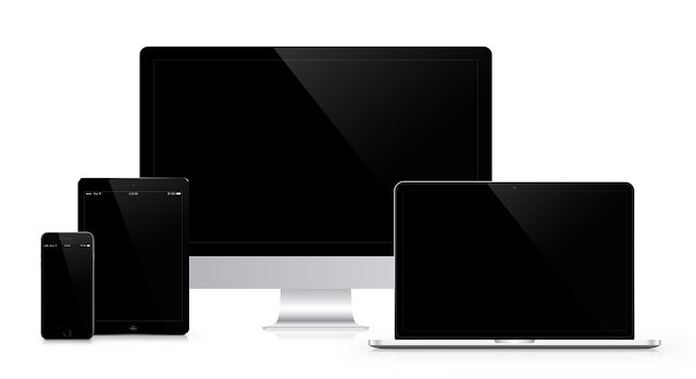
Every designer is eager to stay on the top with the latest up to date information. The practice of web designing is a bit tricky, to make the process of website design and development smooth is challenging thing to do but staying alert and adopting latest trends and tactics will make your web design responsive.
According to most of the industry’s renowned design experts, the creative design industry has been dramatically transformed with an extensive range of influential elements and concepts.
Responsive Web Design Layout
Creative designers have undoubtedly adopted several newer approaches and unique tactics to deliver the best in class web designs. There is an extensive range of concepts that have completely changed the meaning of creative web designing where responsiveness of the design elements is of utmost importance.
According to most of the creative design industry experts, responsive and fluid web designing has become one of the founding pillars of a well-defined and well-structured website design.
Mobile Friendliness
Mobile friendliness is another most important element that appears on top of the list for creative designers. Now professional website designers take it for granted that the website will be fully mobile friendly. In order to better meet this target, design professionals have to deal with a number of complex and challenging stages during the project.
According to most of the experts, they have to accompany several universally accepted mobile device display sizes and they have to critically make it possible that the website performs absolutely well while being accessed on any of those screen resolution sizes.
Unique Picture And Graphics
Designers should use storytelling strategies in the form of unique graphics and animation. Including graphics in the form of images, videos and Gif’s make the user experience favorable and interesting. It has a lot of potential in gaining visitors attention and therefore designers assume that in 2018 this will gain more popularity.
According to several design experts, images and pictures are considered to be one of the most essential and striking elements of the entire website design theory. These images and pictures help a lot in delivering a unique and more compelling image of the overall brand and contributes a lot to the overall look and feel of the website. Now short animated images or GIFs are trending higher among the entire community of creative website designers all across the world.
Expressive Typography
Designers are converting their homepages and including bold and expressive typography. Look for bold, colorful and expressive typography with massive headings and texts blocks that make the context of the site clear to the visitors. Designers believe this practice works best if the rest of the page is simple and clean and the fonts are readable.
Cinema Graphic
Cinema graphics are the still photos that include little movements. Creative designers are using this creativity by creating engaging graphics that increase conversion. Choosing cinema graphic over images is a good tip. If you’re looking forward to modernizing your site then inserting graphic to your website is a great way to enter 2018
Greater Use Of White Space
White space is nothing new for the designers. It will continue in 2018, designers are finding greater use of white space and they will continue to use it. Everything on the web page will have a beneficial purpose. White space will increase conversion and leads.
The concept of white space is basically the result of today’s dominating mobile technology. According to most of the professional’s negative space helps them a lot in making the overall website more prominent to the end users. White space is highly beneficial in terms of making the important elements more visible to the target audience while utilizing the limited screen resolution and coverage of mobile devices.
Easy Navigation System
This is a feature that provides a user-friendly experience to the users. Creative designers concentrate on providing easy to navigate system to the user. Navigation is an essential element of a website, inserting navigation menu and sidebars should be included to ensure the users can easily find what they’re looking for. Complicated navigation is worse which will result in users getting confused and leaving your site. It’s essential that the map shows everything a user wants.
Internet of Things (IoT)
Internet of things has taken website development to a whole new level and is continuing to make a great impact. Designers find this a big trend of 2017 and will continue to in 2018. IOT devices are connected to the internet ranging from security cameras to machine devices used in everyday lives. Designers believe that IOT is a game changer and it will continue to grow in the coming years.
In 2018, the creative designers will continue to follow the main trends of 2017 and adopt fresh and new ideas and colors.
Zoe Peter is an online designer and a passionate blogger. Zoe is associated with leading Web Design Company in Singapore. He loves to write about web marketing, web design, digital marketing and much more. Apart from writing, she loves reading, traveling and exploring new places.