Recommended Reading On Usability
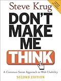
Don’t Make Me Think

(By: Steve Krug )
Don’t Make Me Think is my favorite book on usability. This is also a very popular book among developers. If you are owning a mobile app or website design you must read this book once.
Onboarding Experience
Prompting to share their social media details on welcome page can annoy users as it solves ‘your’ purpose of getting information but not ‘users’ urge. Instead, engagement through service offerings can ultimately enhance UX as it solves user’s purpose. Following the ‘customer first’ approach by placing user’s need at the top will surely put a smile on their face.
Visual Design
Next on list is ‘what is seen’ quotient. It is often said that you get what you see. Appealing visual design is created by using harmonized color selection and interactive touch points which blends well with the brand image. This is really one of the most crucial thing when it comes to ‘first impression’.
On a broader level, visual design is not just about colors, display, and placement of interactive button but it also embraces the brand identity which strive to create an image through design. This includes placement of logo in design, navigation consistence, texts, fonts, and of course the layout.
Communication Tone
This is perhaps the most underrated thing in UX. The tone of communication through which the app interacts with its user is vital for enhances UX. Simply writing down the words is of course a good idea but imaging communicating with users creatively.
For e.g.; instead of a pop message – ‘Location change detected. Want to save this?’ how about communicating like ‘Hopping places? Mark this home?’ It is only through constant innovation the UX is enhanced. And when talking about innovation, it has to be consistent everywhere, including the tone of communication.
Ease of Navigation
Easy-to-skim app design is an asset which helps in holding user for longer time. With simplified Navigation option user is getting a chance to know more about the offered services. Not only this enhances UX but it also serves the purpose of informing prospective consumers about the business propositions. By easing up the navigation process one can really frequent the user’s flow to app.
Search Options
Imagine a scenario where you are finding something in your own house and you are not getting it. Everyone has gone through this in real life but when it comes to virtual life – no one likes it. This is because there is no dearth of apps and services online. If not you, someone else will give what users are looking for.
Therefore giving easy search options and displaying accurate search results can yield better UX. Integrating search options along with the filters and relevance can surely ease up user’s search and ensures smooth flow throughout the app.
Preference Selection
Allocating wide range of preference selection in user’s hand will surely compel user to push the envelope. This is the opportunity to know about the users and here is the place where most of the firsthand information is generated by users – easily. Giving check-boxes along with the display of preferences will prompt a reply and engage user. But the horizon for preference ranges from social media, emails, to app alerts, etc.
Notification
Once the preferences are saved the activity for offline interaction starts. Once the user is sure of the services to be utilized, same has to be offered. Instead of unnecessary ad and update notifications, it is better to notify users with what they have asked for. This will ensure maximum user turnaround rate by bringing them to the app for checking notified update.
Being There. Even Offline.
Sure, apps run only when it is connected with the internet network. But there may arise situations where Wi-Fi network goes weak or perhaps user runs out of data pack. This should not stop them from coming to the app. The middle-path is by making some of the vital information available offline. Depending on the type of apps few of the things like profile update, latest news feed, and settings functions can be made available offline.
Keeping With Updates
The job is not done by just delivering app. No, not even the download and install marks an end of the job. UX is an ongoing process and therefore it is really necessary to keep up with updates based on user reviews. Parallelly running the simulation check for discovering bugs is also essential for enhanced UX. Updating and debugging the app from errors will surely retain users’ faith on the app and ultimately contributing to brand credibility.
Henceforth, the urge for enhanced UX is achieved by constantly working on the app even after it is rolled-out, downloaded and installed. The success of any app depends on how satisfied the user is and how well it can retain them for longer time. The ultimate goal for any UX designer lies in solving the end-user’s purpose as efficiently as possible.
Shahid Abbasi is a marketing consultant with Peerbits, a one of the renowned iPhone app development companies and the home of app enthusiasts. Shahid likes to keep busy with his team, and to provide top-notch mobility solutions for enterprises and startups.