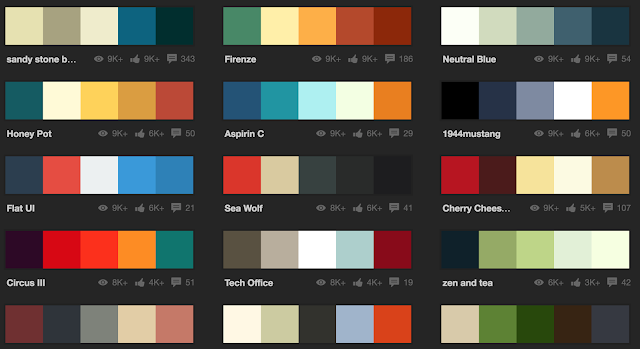
Colors have a strong impact on what emotions the user will experience when they visit your website. These feelings will eventually shape their behavior and interaction with your website. According to a research from QuickSprout, it was found that 90% of the products are assessed based on their color; whereas 85% of buying decisions are made depending on the color.
Most web design books talk about color choice, however its still a difficult choice for designer to pick the right, unique color scheme for each website. A bad color choice may fail your design.
To understand the psychology of color in web designing, it is important to understand what kind of color tones elicit particular reactions. Choosing the right color for your website will increase the conversion rates, and will be eventually profitable for your business. Therefore, many businesses opt for professional web designing companies such as WSI to get the job done right.
Tones and Themes
Most business websites give priorirty to their brand or logo color when they are getting their website designed. However, a lot of things come under the umbrella of color such as; contrasts, hues, themes, and tones. By playing with these options, you can attract viewers, but make sure that it is not so vibrant that the user stops paying attention to your content.
Trying out different tones and contrasts will help you in finding the right color which has the most effect in increasing the time the user spends on the website, and also on conversion rates. It is also important that you choose color according to your target audience and your product.
Call-to-Action Colors
Colors like bright red and yellow are used to bring attention to something important and note worthy. This could be a phone number, website link, or some caution that should not be missed. However, it is advised that these colors should only be added to particular texts and not the entire website, as they can result in reduced conversion rates.
Neutral Colors
Neutral colors are those which include; hues, shades and tints of white and black. These colors are used with main colors, but they are usually the ones that dominate, as they do not overwhelm the audience like bright colors do, and keep them focused. The color of the text plays a vital part too, when deciding the background, because not every font color goes well with bright backgrounds.
Lighter tones such as white, give an optimistic mood to the website; nevertheless, it can also make the website look boring and ordinary. Similarly, grey can give an outlook of sophistication and professionalism, but it might give away a chilly and unwelcoming feeling to the user as well.
Warmer Colors
Tones of yellow, red, and orange are included in the category of warm colors. The use of these colors in web designing will give a touch of creativity to your website, and will have affectionate and calming influence on the user. However, these colors also have the power to elicit emotions such as aggression and anxiety. This is the reason it is important to use such colors carefully and strategically.
Cooler Colors
Web designs with cooler tones which comprise of; blue, purple, and green, look more engaging and encouraging, but on the contrary, it can give the opposite result too, if not used properly. The lightness, darkness, and type of color must be modified to convey the right message to the potential audience.
My Favorite Tools For Picking Best Colors
- Colors By Adobe – Pick from many predefined color schemes. Less hassle with proven color schemes that are used by best designers in the world.
- Check My Colors – Pick colors from any website.
It is also essential to design the web site keeping your target audience in mind. If your target audience includes children, then probably the use of bright colors will have a positive outcome. Likewise, if the target audience is of women; then purple, blue and pink hues may have greater success. Although people underestimate the use of color in web designing, it does have an impact on the choices of consumers, so choose wisely.