What is common in successful apps?
Most downloaded apps have those minuscule squares with rounded edges in common, what we called as App Icons.
Here is the answer to your above question:
“Successful apps have the best app icons in common.”
As it is said,
Books are judged by its cover. Similarly, apps are judged by its icons. Because icons are first noticed rather than its title.
Yes, app icons play a massively important part in terms of user’s perception to an app and the number of downloads as well. Icons even responsible for CTR(Click Through Rate) in mobile application.
Apps get rejected from app Store just because of bad icon design. And if in case it is accepted, your app has to compete with 1.2 million other apps. You don’t want your app icon to be drown in mundane. Designing the perfect app icon can make your app stand out of others.
How to make an app icon more magnificent with immediate recognizable appearance?
But Wait!
Prior designing an app icon, you must do a meticulous research on the market. Detailed study on your competitors will enable you to design such icon that withstands the competition.
Here are some tips for designing attractive and download-inducing app icons.
Simplicity Makes A Difference!
App icons are small designs that shrunk even more (114 x 114 pixels) when reaches to App store. Complex looking icons are difficult to be identified on the home screen and store as well. It’s better to keep the things as simple as possible.
App icons represent your brand/website and so it must attract potential user’s attention. The users will search for an app in the store and so your app icon must grab their eyeballs instantly.
No Text Please!
Text is not readable on icons. An app icon is only a few pixels wide, leaving little space for clever wording. Words on icons is just a waste of precious space on such small platform. Even the master of app icon design Michael Flarup uses no words on his icons. Avoid text wherever possible!
Unique Shapes With Vibrant Color!
Are you planning for two or three colors for your app icon? Then, think over it again! Because this may compel the viewer’s eye to skim over it. The majority of the successful app icons chooses limited color scheme. Refine your color palette and make the right choice!
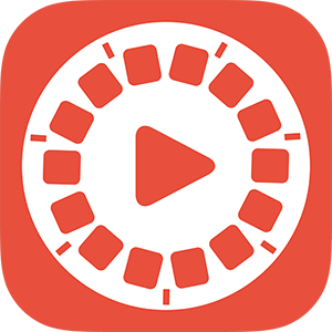
Try to be unique with your icon shapes. Because unique shapes will be easily recognizable and makes your app stand out in crowd. Take an example of flipagram.
Be creative when designing the shapes of your app icon!

Easily Recognizable Of Symbols!
Millions and thousands of apps are placed on App store or Google play store. How to make your app icon recognizable among those million of other app icons?
The easily noticeable app logo will make your icon unique and different from others.
Work On Details!
When millions of icons are in a race to grab user’s attention, then you need to add details to your icon. Because details will make a difference in such a fierce competition.
Work your best on things like great border and graphic designs!
Go For Test!
Test your icon before placing it in an app store. Because test may reveal flaws or anything that need to be done perfectly. You can test your icon with and without borders. Borders make your app to look contrast on different wall-paper and even unify several apps, if you have in an App store. Test both possibilities and determine whether your icon needs a border or not!
Finally, place your icons on iPads and iPhones and see how it looks!
Important Suggestion
iOS and Android icons are distinct in their own way. In case, you want you app icon to look identical in both stores, then you need to adjust the corners of your icon. Because Google play store will not do this, while Apple will adjust your app icon.
What You Need To Avoid While Designing An App Icon?
– Glossy effect on your icon.
- Any photo as your app symbol.
- Skeuomorphic design
- Transparent background (iOS Apps)
Above 6 tips will help you to make your app icon alluring and will grab more user attention!
Conclusion
Icons are first to get recognized and most users download apps merely on the basis of its icons. So, why not make attractive icons. Good icons create a good impression on users and even help with user retention. Take your time and design decent-looking app icons!
