Mobile is different to web. So the way we design mobile apps is different to how we do it for web. The size offered by mobile screens is less and thus the app needs to cater to all the features sleekly and compactly. It goes into a certain length with a scroll offered to the interface and therefore it is conceived and conceptualized in a different way. Presentation and communication resources for mobile apps are therefore attempted at a different scale and with different approach in mind. It’s important to keep your mobile app follow a certain scheme and go by a foolproof technique to be supplied with right design components, the right way. As a designer this requires you to build it following some rules and go by a mobile deign checklist that assures your app looks at its best.
5 Questions To Ask Before Starting Mobile App Development
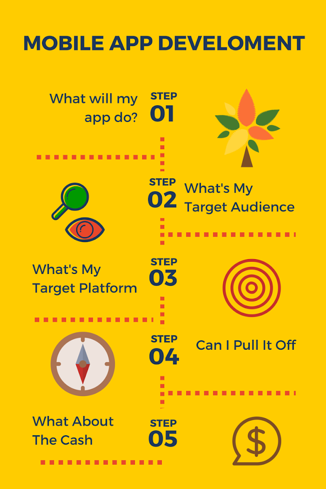
Developing a mobile app is anything but easy. There are so many variables to take into account that it just takes a minor slip to end up with a whole different product. Whether it’s the design that you don’t get right, the set of features, the target audience or the target platform – there are numerous elements that can make or break your app. Luckily for you, we’re here to help, so we’ve put together an easy-to-follow model you can follow to ensure you’ve got all your ifs and maybes sorted out before you get coding. Here are 5 questions you need to have a clear resonant answer to before you start.

1. What Will My App Do?
This might be completely obvious, but you’d be surprised as to how many developers don’t have a crystal-clear vision in their head before they start working on an app. Sure, they have a rough vision, but it’s fuzzy and unclear – not exactly the greatest start point.
In order to avoid this pitfall, make sure you can explain the purpose and functionality of your app even to someone that has no technical knowledge whatsoever without stepping on your own feet. If you can accomplish that, it means you have a clear idea and you’re ready to move to the next phase.
2. What’s My Target Audience?
This might seem like a no-brainer again, but once again, it is one of the most common mistakes developers make: starting out without having a clearly defined target audience. You can’t satisfy everyone, and that’s a hard fact, so don’t even bother trying to appeal to everyone. Instead, determine what your ideal target audience it, and focus your entire attention to cater to the needs of that specific segment. Usually the target audience is what determines how the design will look, the amount of features involved, the tone and approach of the in-app content and so on. Choose wisely.
3. What’s My Target Platform?
The answer to this question is influenced by a variety of factors, but one of the predominant factors is the one discussed above – the target audience. There’s no point in developing a children’s game for a Blackberry, and not just because nobody develops apps for Blackberries (ok, not entirely true, but you get the idea), but because said platform is generally used in business environments.
Ideally your target should be available for both iOS and Android, but if your resources force you to choose only one platform to focus on, choose the one you’re more familiar with.
4. Can I Pull It Off?
So you have the idea, the target audience and the platform; now all you need is a solid plan. Make sure you have the proper skills to pull it off, or seek help if you don’t. Don’t be afraid to ask for external help or even outsource entire blocks of the development process if it’s too much for you. Keep in mind that there’s no such thing as a good-for-all; if you want top quality, do the part you’re great at yourself, and delegate everything you’re not an expert in to someone who is.
5. What About The Cash?
Sugarcoat it however you want, but the truth is that everyone does it for the money, because at the end of the day, we all have a mouth (or more) to feed. With this in mind, what’s your monetization plan? Will your app be a paid one, ad-supported or subscription based? Will you rely on paid downloadable content to make profit? Sure, you could offer it for free and hope that people will like it so much that they’ll be inclined to donate. But what if they don’t? Be sure to have a monetization strategy, otherwise you might have to turn the lights off sooner than you thought.
7 Point Checklist For Amazing Looking Apps
1. Get Touch-friendly
Try to get in the zone of ‘touch’ or you will not be able to receive the desired response from your user. Try using Image Carousels, Off-Canvas Flyouts, Accordeons, Drawers and other supporting resources and effects that let your app behave touch-friendly.
2. A Great Icon
You have to have a nice icon to gain an edge over your competitors by making your app easily recognizable. Use your logo here to present your mark better in the perfectly planned icon. Just avoid copying what others in the business are doing. Plan your stuff representing your individuality right.
3. Use Quality Images
It has been depicted in a survey held in 2014 that the apps using good product images registered 9% better conversions than their close counterparts. So, get serious with the way you select, use or implement images and achieve big with your mobile endeavor. Using high definition images and applying them just as needed would help.
4. Visibility Of Buttons And CTAs
While applying buttons and CTAs on a mobile app interface you need to go by strict size conventions to make it visibility viable. CSS for button that you have to implement should go with these measures:
Apple: 44×44
Android: 48×48
Windows Phone: 34×34
5. Make Your Copy Readable
The ideal dimensions for font size are 14 px and above. Just make sure you have met this requirement well and made your copy readable by the user without them having to zoom or move screen or change resolution. Further, proofread it twice to manage the quality of your copy.
6. Portrait/Landscape Reflow Is Smooth
It’s important that you provide for seamless mode switching in your app. Offer the user with the flawless experience shifting the portrait mode to landscape mode and vice-versa. This could be needed by them quite often depending on the type of screen interaction and display configurations placed with the app. So, get them tune in well with smooth reflow of screen modes.
7. Avoid Image Text
Images don’t support texts well and they are mostly unreadable on a mobile screen. It is better to have your texts used and implemented separately and not in the form of an image.
Conclusion
Basic but effective ones! Following these points should help you get the right version of mobile design that is received avidly for quality and performance. The way you treat them will decide on how far you succeed to have an awesome mobile app design!
Sumit Garg is a Mobile App Developer and Technical Writer at MobilePhoneApps4U. He has over 10 years of experience in web and mobile application development. He also provides hybrid mobile app development solutions to help clients in endorsing best mobile strategy.