Want to create best responsive websites? We have gathered some responsive design inspiration for designers. This list contains responsive design examples to trigger your creativity. When I am working on creating a responsive website I look for good examples of responsive websites for quick start.
In this digital age, a website has become a brand building and sales hub for most businesses. Therefore, it is crucial that your website reflects the needs of its users.
Today, more and more people are accessing the web from their smartphones. Every business, be it a Fortune 500 company or a local florist, needs to make sure that the user experience on its site is seamless no matter what device is being used by potential customers to access the site. Responsive web design provides an optimal viewing experience to users on desktops, laptops, tablets and smartphones.
With responsive web design having gained immense popularity in recent times, it is now considered one of the best ways to design websites for a range of devices with varied screen sizes. Responsive design is the in thing presently for smart phones to smart TVs.
Here are great examples of RWD from across the Web:
Change.org
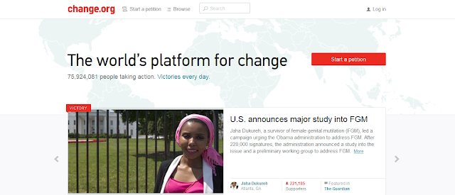
Change.org is world’s largest petition platform allowing users to create and launch petition campaigns for various causes. This is also a popular responsive website example for web designers worldwide. The visual displays and responsive approach are consistent on this site. The navigation is easy, seamless and intuitive. RWD of this site has been kept simple and practical to clearly focus on the causes it supports.
Google For Entrepreneurs

This site is designed to work on a range of mobile devices and screen sizes, irrespective of the fact, whether your phone is a touchscreen or you use a mobile device with a keypad or trackball. It offers a fast and easy browsing experience for users on all devices.
Gatwick Airport
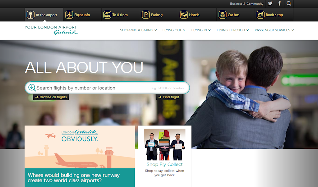
This is a great example of a user-friendly website. A neat menu opens nicely into a page with further information ensuring passengers see only what they are interested in, while a ‘Book a Trip’ menu helps personalize user experience. It lets passengers check flight times, terminals, parking arrangements, delays etc. on their mobile devices easily.
Microsoft

The RWD for Microsoft’s website is a text book example of how RWD must be used onsite. The biggest achievement of this website is the cleanliness of the design. A simple design removes all the clutter while maintaining a refreshingly simple aesthetic. In general, the overall layout of this site is spacious and clean.
General Electric

GE uses a long page design, which nicely highlights the brand’s story and message; thereby humanizing the brand. The site is great because the big pictures and video aren’t sacrificed when the page is scaled down.
Sony
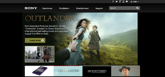
Sony embraced responsive design to ensure visitors view the same beautifully crafted pages regardless of the device used to browse for information. Their responsive site organizes the product information section pretty neatly.
Currys
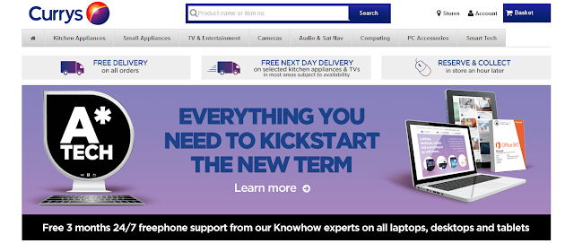
Currys, a site selling electrical appliances and electronic devices, offers an immersive buying experience for users with beautifully responsive design. It lists hundreds of thousands of electrical products on its website, but the design is elegant, information is well organized and navigation is concise even on small screens.
AIDS.gov
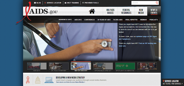
This government website has smartly incorporated a responsive design. Even, though it has been a few years since it launched, AIDS.gov is one of the better examples of using responsive design to deliver a strong message.
Hubspot

Their responsive site is clean, easy to navigate, and fits well within the brand’s aesthetic. The grid has been so designed that the website can be easily resized. The result is a beautiful responsive site that doesn’t sacrifice any of the site’s original design.
Disney
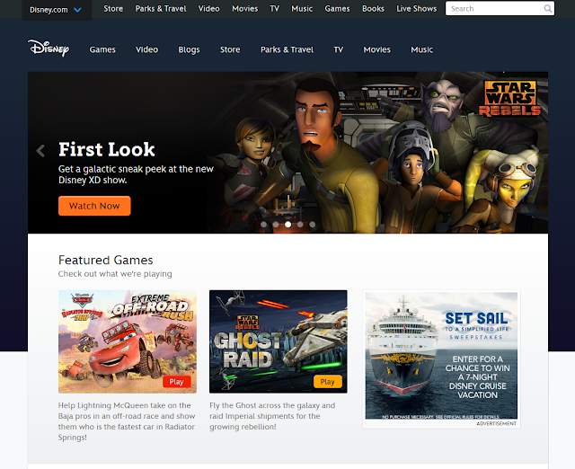
Disney’s website looks great on desktops, as well as, high end smartphones. It is filled to the brim with content, be it games or movies, and can be easily accessed by children and parents on all devices. RWD helps form a proper structure for the website, creating a pleasant content flow for visitors.
Mashable

Mashable has built two menus on its site for RWD purposes. It even hides the comments for users on mobile devices to help them focus more on the content. Plenty of different features come together on the site, all of which not only look good but have tremendous usability because of RWD.
The Next Web
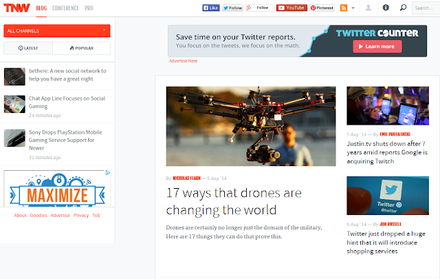
This site’s RWD fold works well in large browser windows, an iPad sized window or a 6 inch smartphone window. The transitions flow well and the design remains elegant on all devices. It doesn’t kill the content and persuades users to stay longer on site, irrespective of the device through which they used to access the site.
Adventure.com
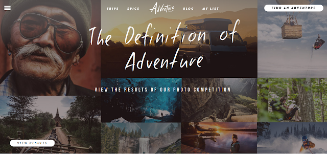
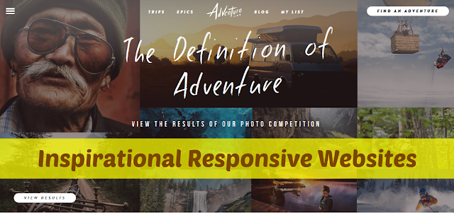
This is a clean well-organized website that is based on a flexible horizontal stripe layout. The site works very nicely on desktop and mobile, offering amazing levels of consistency and simplicity to its users.
Tattly
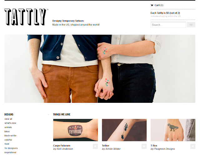
Tattly is a temporary tattoo store with a responsive layout which makes sure the site translates well on a huge range of devices or window sizes. Most of the responsive websites take the approach of reducing the column size to one to be easily viewable on small screens, but Tattly takes an innovative approach of experimenting with multi-column layouts using lot of whitespace.
Fit For A Frame
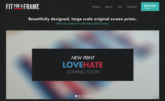
It is a well-crafted responsive site that allows ease of access to a range of gorgeous prints and thoughtful designs.
Starbucks

With the help of responsive web design, Starbucks offers lots of features that can be easily accessed on a wide range of devices and screen sizes. A feature such as store-locator displays well on mobile devices; this makes it easy for consumers who are on-the-go, to look for the nearest Starbucks.
EBags

eBags is one of those eCommerce sites that has fully utilized RWD. It offers a wide range of products without cluttering the site with excessive menu bars and options. Moreover, gorgeous high-resolution images of bags adapt to the layout of any device, enticing visitors to take desired action.
IndoChino
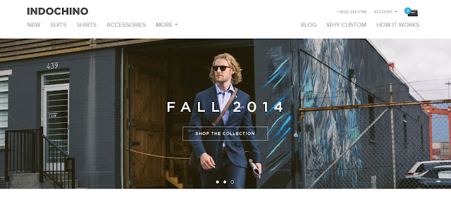
Elegant yet dynamic aesthetics of this site display well on mobile devices. Drop down menus for different categories make for a well-crafted page that allows ease of access for users on mobile devices.
MacDonald Hotels & Resorts
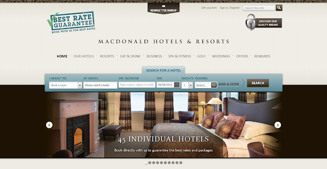
It’s a wonderful trend to see more and more hotel businesses re-vamping their online presence by utilizing responsive web design. In the case of MacDonald Hotels, the website seamlessly blends modern page design with extremely user-friendly functionality making it easy for users to browse for information or do bookings regardless of the platform used.
Wendy’s
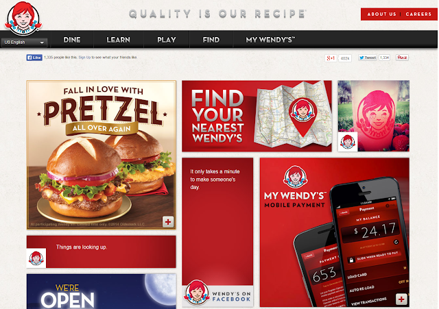
The site incorporated RWD making it easy for users to scroll and zoom through the website on their cell phones. The responsive web design on this site features a friendly look with easy-to-navigate layout and big bold images.
Evergreen Responsive Web Design Examples
Easter Seals
Easter Seals is an organization that helps individuals with disabilities and special needs
and their families. The organization helps them to live better lives and has been operational
for nearly 100 years. The Easter seals responsive website is a clear demonstration of easy navigation and better readability, emphasizing the use of ample white-space and pleasing fonts.
Salesforce.com
Sales force was launched fifteen years ago with a vision to reinvent CRM in the cloud. The company also has formed the Salesforce.com Foundation. The company is now the global leader in CRM. The responsive website demonstrates its leadership and direction defining abilities, while presenting information in a neat and uncluttered fashion.
Whole Foods
Whole Foods Market markets itself America’s healthiest Grocery Store. The organization is
in operation since 1980 with just one small store in Austin, Texas back then. Today, Whole
Foods comprises of more than 360 stores in North America as well as the United Kingdom. The responsive web design for the website exhibits the mission driven values of the company, providing people with an entire menu of healthy options to choose from even while they are on the go.
Notredame University
The University Of Notre Dame is a higher education provider with emphasis on morals, intellectuals, and firmly embracing a service ethos. The University was founded in 1842, by Rev. Edward Sorin, C.S.C. – a priest of the Congregation of Holy Cross. The university’s responsive website is reflective of its deep values as well as provides its students and visitors with a quick yet exhaustive overview of its philosophy as well as its education curriculum.
Design Crowd
Design Crowd is a graphic design company that was founded in January 2008. It is an online market place that provides logo, website, print, as well as graphic designing services. Those requiring these services are provided access to freelance graphic designers as well as design
studios on a global basis. The responsive website demonstrates its professional intent and
effectively portrays its creative genius.
Rally Interactive
Rally interactive is a company that ‘builds digital things’ and headquartered in Wasatch Mountains of Utah The responsive website portrays a rugged look and definitely appeals to those who have a passion for the outdoors just like the founders of this website.
Web Designer Depot
Web designer depot is a company that designs responsive websites. The agency’s responsive website is itself a demonstration of great responsive design skills as the website claims. Rather than building pixel-perfect mockups as their web blue prints, their responsive design takes a different approach – a collaborative approach between the designer and the developer for superior results. This is an amalgamation, rather than being two separate tasks altogether.
Andersson Wise Architects
Anderson Wise Architects is an Austin, Texas based architecture and design studio, which is into residential, institutional, and hospitality architecture. The responsive website is careful crafted and is as reflective, aesthetic, and pleasing as their work.
Shiny Demos
The Shiny Demos website is an effort of the Opera Browser web team, which is a demonstration of the growing open web preference around the world. The responsive website is a shining example of all demos put together.
William Csete
This is a brilliant example of responsive design by developer William Csete. He currently enjoys his time as front end developer with Apple, so is unfortunately not available for freelance projects.
Forefathers Group
The Forefathers Group is a website design agency that is reputed for an ‘iron-fist’ approach towards design. The responsive website beautifully orients itself on practically any device and gives substance to the agency’s reputation.
Time
Time is an American weekly newspaper magazine that is headquartered in the USA, being published in New York City. Founded in 1923, it has the world’s largest circulation for a weekly news magazine. With a readership of 25 million, nearly 20 million of its readers are based in the United States.
FortyOneTwenty
FortyOneTwenty is a full service video production company based in San Diego. The company constantly pushes itself, its equipment, and its approach to the edge. The responsive website of the company reflects its ethos of being continually interested in the interesting, and always strives to discover and grow.
Oliver Russell
Oliver Russell operates at the confluence points of “cause, commerce and community”. It provides a range of services such as brand design, integrated campaigns, as well as cause marketing for purpose-driven companies as well as organizations, which range from the Fortune 50 to top social entrepreneurs. The company’s responsive website completely reflects itself as a strong and serious player, committed to its own cause as well as that of others.
Stephen Caver
Stephen Caver is a designer developer who pays great attention to detail in his site designs, which is evident in his responsive web design as well. Stephen has a wealth of experience in information architecture, interaction design, HTML, as well as CSS.
United Pixelworkers
United Pixel workers has come from a long way from being a little web design studio in Pittsburgh, PA called Full Stop to making t-shirts for all 50 states. Rather than just being a t-shirt storefront, it has now made thousands of t-shirts to pixel workers all around the world. This idea is born of and supported by the web community. The responsive website is a reflection of its journey from its beginning to the present.
Currys
Curry’s is a multi-store appliance dealer in the United Kingdom selling a wide range of appliances. The responsive website reflects its forward and modern image that it would like to convey to its mobile consumers.
Lancaster University
This is the website of the renowned university in Lancaster, UK. The responsive website reflects ease of use and simple dissemination of information to students and prospective students all around the world.
Nixon
Nixon sells watches as well as premium accessories. The responsive website reflects sophistication, classiness, and style, which people can access on their devices even while on the move!
BBC
As one of the most respectable news websites in the world, the BBC’s responsive website is an
example of a reliable and responsible news website for people who want to access news while
they travel or whenever they are with their devices, but away from a personal computer.
Nokia
A modern, stripped backdesign incorporates clean grid lines and primary colourswith a smart, welcoming structure that prioritises their leading products.
MailChimp
This free-to-use email newsletter site features a smooth, rational design structure with clear navigation and a minimalist, highly effectivelook and feel.
WWF
Striking graphics and captivating imagery dominate this website. Calls to action are illustrated with beautiful animal photos, attractive fonts and friendlydesign details.
These smart and stylish responsive layouts can be a great source of inspiration for business owners that are looking to revamp their sites with RWD.
One
This not-for-profithas a fresh and extremely beautiful site featuring a black-and-white colour scheme. The slick homepage showcases up-to-the-minute statistics alongside enticing calls to action.
Google Cultural Institute
Designed as a virtual museum, with the option to take a tour and watch a video, this slick website combines elegance and simplicity with highly informative, easily accessible content.
Grey Goose
Everything about thiswebsite epitomises the brand image,from the effortlessly cool colour scheme to the clean, simple typography, resulting in a beautiful, cross-platform design.
Big Lazy Robot
A fine example of the ‘less is more’ mantra, this studio’s site details the bare necessities – their work and achievements –with a relaxed, no-frills design that is both engaging and informative.
Mulberry
A simple grid layout, exceptional imagery and ample use of white space create a harmonious shopping experience across all devices. Nifty additions include a one-page checkout process.
Are you designing your own website? Chances are, then, that you know just how tricky it can be to pull all the elements together and create the ultimate browsing experience. So we’ve done the hard work for you, collating 20 of the best examples of responsive web design to inspire ideas for developing and designing a dazzling new website.
So, what exactly is responsive web design? Put simply, it’s a term todescribe websites that are designed with the user in mind – with smart CSS (colours, fonts and so on) and flexible grids and layouts. The best RWD sites are easy to navigate with a fluid, logical design, fast loading speeds and user-friendly content. They are accessible across a range of devices and adapt automatically to the viewing environment (be it laptop, desktop or mobile) using flexible images with adaptive orientation and resolution.
John Siebert is the President and CEO of Tranquil Blue – A Web Design Tampa Company that focuses on all kind of website design, mobile app development and search engine marketing.
Diwiyne Johnson is associated with Vanity Point – a website design and development company, since the last 5 years. In her free time, she likes to play chess with her friends. You can follow her on twitter @DiwiyneJohnson
Marco Rosano is a highly capable and well-respected digital strategy consultant with success and experience with online businesses. Marco has over 10 years experience in web development and online marketing and has founded four digital businesses here in Australia.
Holding a Master of Technology (Internet & Web Computing) from RMIT, Marco has created valuable business assets within online industries and by using online mediums.
As Managing Director of Soul Digital, Marco is responsible for new business and setting digital strategy across the agency. He has the ability to create innovative, yet simple strategic online directions and transfer these into opportunity for his clients. His key skills include a love of all things design, online/inbound marketing and web development systems.
