Web design changes faster than the seasons change. Neon colors get replaced for the sleekness of black, photos get replaced for cool graphics, and then suddenly photos are in again. There’s no universal truth to knowing what will remain popular.
But it is true that no one wants to spend hours – or even minutes – trying to navigate their way through a difficult website. Here are ten tips to make your website usable and fun to use:
Simplicity
We may be in a technologically hot world right now, but websites that feel like labyrinths are not fun for anyone. Even companies that do complicated things, like IBM, know that if they want followers, they need to keep their website sleek and comfortable. Customers can get frustrated quickly, and chances are you’re not the only one providing what they’re looking for, so they’ll move on if they get lost. Have a very easy site map users can navigate through quickly.
Consistent Look And Feel
Keeping the overall look and feel consistent is really important for user to feel comfortable. Keeping common UI elements consistent makes the user learn the navigation easily and quickly. The website should follow patterns to achieve efficiency. Once a user learns to use one part of site she should be able to use the same knowledge on other parts of the site as well.
Driving consistency in website can be really difficult if you try to invent your own navigation controls and tools. Its best to stick to standard UI frameworks and commonly accepted controls for ease of use.
This is one of the main reason why many Javascript and jQuery based UI frameworks have evolved. Using such framework will ensure your website has consistency in most part.
Be Paranoid About Page Layout
Designing a good layout is one of the fundamentals of a good graphic design. Designing the right page layout is critical to a highly user friendly website. The structure of the page should be based on the importance of the elements. Each item of the page must be carefully considered and placed to draw attention towards the most important action or information on the page.
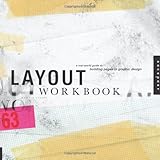
Layout Workbook: A Real-World Guide to Building Pages in Graphic Design

(By: Kristin Cullen )
Learning to Design a good page layout may not be very easy for any new graphic designer. The Layout workbook by Kristin Cullen is an excellent book to learn basics of graphic design. The second half of the book also contains excellent example collection of good layouts for your inspiration.
I will highly recommend this book to improve your graphic design skills.
Communicate To User
The user interface should communicate all results and response to the user. Always inform the users of success, error or any change in status. Not having proper feedback confuses the user and leads to frustration.
Smart Use Of Color
Use colors to direct attention toward UI items. Highlight the important elements with right colors. Device a strategy for using colors in a theme. Stick to maximum five colors on your website theme.
Label Your Labels
In a study that used eyetracking to evaluate the usability of search forms, results revealed that the least confusing and most preferred way to design website labels is by putting the information above the fill-in box, so that the form is filled out from top to bottom, instead of left to right. Take Southwest, for example, a hub for fill-in boxes.
An Infinite Scroll-page
Users don’t like stopping if they don’t have to – and if the content is interesting. Popular websites like Forbes already implement this design – when users think they’ve finished an article, a continuous scroll brings them onto the next article. It’s easy for users to navigate articles and helps boost readership.
Make Sure Your Website Has A Tagline
A mission statement. A brand-vertisement. A single-sentence personal philosophy. Whatever you want to call it, this tagline should be the most obvious and important ingredient to your website. Make sure your tagline or brand is articulate and thought out whether you brainstorm yourself or use a brand name generator – it needs to be catchy, clear, and unique. For example, Apple put up a catchy slogan that both inspired, attracted clients and embodied their philosophy to “Think Different.”
Try Increasing Your Font Size
Forbes ran an experiment in 2013 where they quietly increased their font size on articles. Because of improved screen resolution on computers these days, the experiment was a hit. Now their font size continues to crawl up in articles.
Make Your URL Easy And Consistent
Yes, users pay attention to URLs. If your website has a www.djenyros935m830mnt3985nw.com-esque feel to it, users are not too likely to remember it – or revisit it. Make it memorable, but simple. Notice major companies like Nike aren’t looking for a NikeSportsandGear.com or LoveNikeWeLoveYou.com – it’s just, Nike.com.
Don’t Disable The “back” Arrow
Users find it extremely frustrating when they are trying to return to something that caught their eye on the last page, only to find “Page Not Found.” Rarely will you find a major company with a faulty page.
Have An Easy “home” To Return To
Facebook and Twitter do this very effectively. No matter how far away your users are navigating away from your home page, make sure that home base is just a quick click away.
Be A Good Storyteller
You don’t need to write for a ten-year-old audience, but you do need to be interesting. Avoid boring phrases like “nice” or “bad,” and avoid trite corporate phrases like “join our tiger team!” Tell a story about your company. For example, instead of the standard commercial marketing, a new “Coin” product markets through a video narrative.
Humans Are Attracted To Human Faces
A study conducted by Useable World found that the human eye is most instinctively drawn to other human faces – more than body parts or clothing. But we’re also drawn to where that face is looking. If you want to point your readers to important information, throw in a photo of a human looking at that information. Samsung, for example, has had a lot of success putting up colorful photos of smiling families.
Article Updates
Updated on September 7th 2016 : Fixed broken links