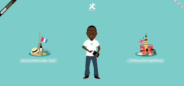
Looking for latest trends in web design? Web is evolving everyday and modern web design trends keep changing every year.
In these days of ever-increasing virtual territory it’s fast becoming obsolete to use one’s office as a status symbol for the brand. People hardly meet together in person to place an inquiry or to strike a deal and this transformation asks for a robust development in your website. All big names in the corporate world are therefore in a 24X7 alert mood in their hunt for latest web design trends. Let us scout for the hottest trends that 2015 is going to experience.
You may also want to look at web design trends of 2014.
Single Page Long Scrolling Sites
As the famous saying goes cut your coat according to your cloth, one should keep in mind the latest medium of viewing prevailing in the market while designing a website. As touch screen smart phones are the order of the day, long scrolling websites are supposed to gain an unprecedented momentum this year. This websites mostly contain all the information in a long single page and scrolling through the page is enough to reach at your desired location. This mode of operation reduces number of clicks required, waiting time for a page to get loaded and in turn positively increases the overall user experience. The smooth transition of information through scrolling makes the interface look more sophisticated and subsequently adds to the brand value of the product. To check out the benefits of these designs first hand, it’s better to go through such websites in your smartphones.
Interactive Websites
For any product waiting to be sold, proper show casing is not the only secret to success. Stiffer competition has led the sellers to get into the field of customer engagement more virulently than ever. Every buyer wants to have a feel of the product before she actually pays money for it. To cope up with this latest development in consumer behavior websites need to become interactive. They need to become as lively as possible and therefore needs to be developed with an element that intrigues the user. Some of the websites will give you the feel of playing a touch screen game that in actuality results in enhanced user interest and increased customer engagement. Other way of making a website interactive is telling a story through various navigational motions designed to operate the website. Many of such websites are creating a buzz in the virtual world where unfolding of a story is primarily what you experience in the surface and this helps the company to convey their message without boring the audience.
Minimalist Websites
Quite often it happens that a user enters into a website and in no time gets lost in the labyrinth of elusive designs. He loses his focus in the maze of tangential designs and after sometime opts to exit. As these complicatedly designed websites often fail to properly communicate with the audience, many minimalist websites across the globe have started to come up with a counter-idea to keep the user focused. They have decided to get rid of every unnecessary feature of the site that does not serve any purpose other than acting as an adornment. This trend was initiated by Google long back but other than search engines the philosophy of keeping the view as clean as possible was not followed much by the popular business sites. But 2015 seems to be the year when minimalism can expect a return.
Websites Backed Up With High Resolution Custom Photography
Using available stock images has been a custom much commonplace in website designing. But with increasing interest in high resolution photography prompted by a rapidly increasing sale in DSLRs abundant use of stock imagery is facing a competition. More and more websites are coming up with actual photographs of people & projects in their portals. This increases transparency among the visitors as they get to know who these people actually are and what work they do. The personal touch increases the intimacy between the user and the seller in turn adding to the approachability quotient of the product.
Websites With Enhanced Font Size
With the increasing excellence in photographic design typography had taken a back-seat for a few years. But 2015 appears to be the year which is going to experience a return of Typography. Non uniformity in font sizes is increasingly being seen as a tool to keep the reader aware and alert. Large fonts are getting used more and more to stress upon the message to be conveyed. More and more websites are using these types of typographical designs which other than standing out from the league of conventional designing also help to reduce the cost of graphic design.
Websites With No Prominent Header Or Background Image
This new trend which is emerging of late can be seen as an extension or combination of many budding developments. These websites following the minimalist approach has reduced the size of the header by not using many a tabs for navigation. Taking cue from the typographical advancements it has increased the size of fonts and simultaneously moved to a center aligned design rather than a traditional widespread one. It has also intentionally got rid of using photographs in the background of the web-layout so that the reader is always focused on the text message other than the visual paraphernalia attached to it. Even if they use photographic images these type of websites are always vigilant on the fact that the visual and text messages do not become overlapping and the user can allot equal concentration to both of them. To talk about the navigational design of these types of websites we must get back to where we had started form. It’s not to click but to scroll through, is what most of these websites follow.