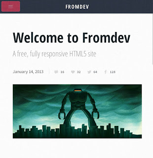
Nowadays, due to increasing popularity and usage of tablets, Smartphone, and other mobile devices, business owners who runs websites and blogs for their business, cannot afford not to own a mobile friendly website. Since mobile devices are hand-free and wearable most of the people today accessing website through it and according to the studies in a near future the mobile online usage will advance and increase. Now, if your business website is not mobile friendly, potential customers and clients will not stay around for long, so meaning you may lose a potential clients and profits as well.
Actually there are number of methods and dozens of inspiring books on how to build a mobile-friendly website. If you want to create website through CMS like WordPress, then you may use free plugin such as WPTouch that improves the display of you web pages in iPhone, iPad and other popular Smartphone. If you want to have a flawless display of web pages on all phone screen sizes then you may use premium responsive theme. Usually the exceptional premium themes costs $25 dollars, but believe me investment is worth the price.
However, plugins and responsive design are not enough, website design as well plays an important role to have a mobile friendly website. The following are some tips:
Make It Short & Simple
Your website has to be light, make it simple and brief and include only the elements that are important to your business like contact, company profile, and shopping cart to name a few. A website loaded with a lot of pages will come out messy on mobile gadgets, as well it load slowly.
Avoid Flash
Flash can augment the look of your site but not necessarily helpful for a mobile friendly website. Since iPhone don’t favor flash, users of this device don’t prefer to visit website with Flash animations. Just stick to the plain text-based content that makes your site to have a well display on all types and sizes of screen and most probably visitors will love your site.
Disable all Pop-Ups
For desktop user pop-ups are annoying but for mobile users it’s quite terrible. Pop-ups are quite good but only for desktop and laptop users but for the mobile users it could be a dreadful experience.
Check Your Mobile Website on Other Devices
Actually there are varieties of screen differences, it means that though your mobile website displaying well in iPad and iPhone, still there is a tendency that it will not show well on other lesser-known gadgets. You may use Screenfly to test website display on different screen sizes.
You can use analytics to see what type of devices are being used for viewing your site and focus more on them. You need to understand that not all smartphones have touch screen – the operating systems, screen resolution used on different mobile devices can be very different. So remember that you may not be able to address 100% of the devices. Make sure to focus on the ones most people are using for your site.
Put Importance on Usability
This can be done by creating obvious buttons and links that are noticeable and easy to “hit”, then provide a location and contact information on the homepage, or else, build it only just a click away, and opt to a font that is readable with proper size that suit to the phone screen width.
Optimize the Size of Videos and Images
Videos and images definitely can slow down you website significantly and ruining the mobile experience of the user. But without video and images it makes your site plain and dull. What you need to do is to reduce or limit the sizes of your videos and images and make it available for non-HD video mobile users.
Response time is utmost important
The best mobile sites are fast, elegant and to the point. Most of the mobile users are going to drive away from your site if it does not load quickly. Understand the needs of your clients and make sure the important information is accessible easily and immediately. Explore client and server side caching options for best performance.
You may also want to try one of the cheapest CDN options based on location of your customers.
If CDN options are not available or you can not afford it you may want to spin your own CDN using open source cdn server softwares.
Let the Mobile User to Have an Option to View the Whole Site
This is very important because there are some users that only want to access a resource or a page of your site that is not accessible by default for the mobile website. Hence the link leading to whole version of the website should be located at the bottom of the page, where it doesn’t interfere.
Creating a mobile friendly website is not easy, there is no magic that can make your site mobile friendly instantly. There’s a lot of things need to consider and most importantly you need to recognize what kind of devices your target visitors are using, and then design and build your site for those.